
Print Collateral, Social Media, Art Direction.
National Council of Negro Women (NCNW)
A historic organization dedicated to empowering women of African descent and their communities through education, advocacy, and social action.
In this project, I collaborated with NCNW to modernize and unify their visual communication, translating their legacy of leadership and advocacy into a cohesive brand experience across digital and print platforms.

Objective
To craft an inclusive and impactful visual communication system that strengthens NCNW’s connection with its members and audiences.
The goal was to reflect the organization’s enduring mission, to lead, advocate for, and empower women of African descent, through consistent, professional, and emotionally resonant design.
Project Scope
Print Collateral
Developing brochures, fact sheets, and membership materials that communicate NCNW’s “Core Four” priorities:
Economic Empowerment, Education, Healthcare and Health Equity, and Social Justice.Art Direction & Layout Design
Creating a design system that balances clarity, consistency, and warmth, aligning modern visual storytelling with NCNW’s historic purpose and community-driven values.Social Media Post
Designing engaging content carousel visuals that highlight NCNW’s initiatives and advocacy work on social platforms.
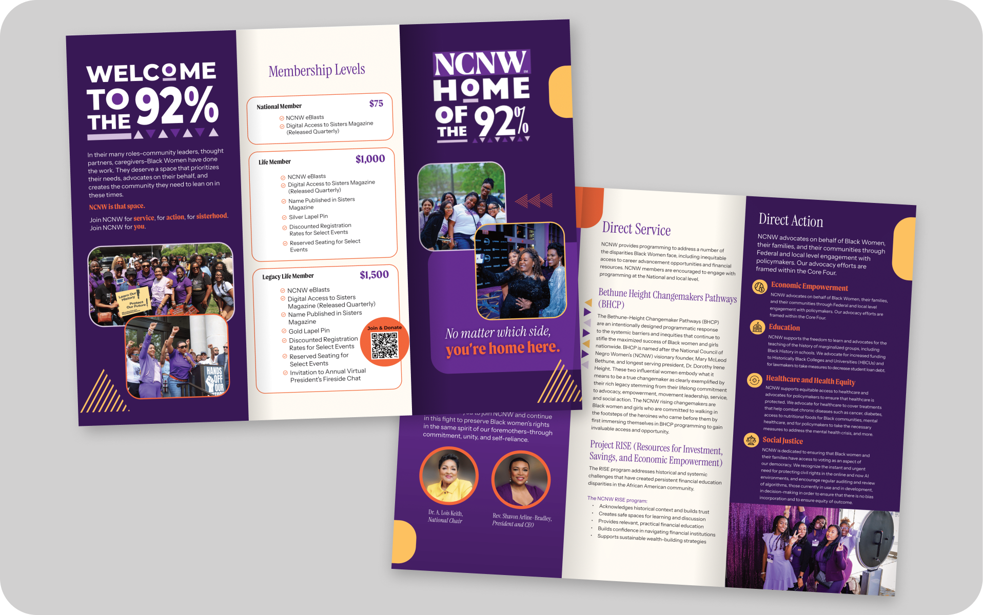
Membership Brochure
A membership brochure designed to inform, engage, and inspire community participation in NCNW’s mission. This brochure is also designed as a strategic entry point to strengthen NCNW’s movement. Beyond introducing membership levels and benefits, this piece positions the organization as a catalyst for collective action, turning awareness into engagement, and engagement into impact.


The NCNW President’s Circle
The circular emblem with the ribbon at the top serves as a hero visual, symbolizing honor, belonging, and exclusivity. It sets the tone immediately, communicating that this is not a generic donation program but a prestigious circle for committed changemakers.
The QR code placement was also intentional. Rather than being an afterthought, it acts as a clear and immediate call to action, making it easy for interested donors to move directly from inspiration to contribution. This seamless journey is crucial for driving real engagement and conversion.
I structured the content to follow a natural persuasive flow, from Why It Matters, to Donor Benefits, to How to Join. This hierarchy ensures the message is not just seen, but felt and understood. Typography, spacing, and color are all carefully chosen to reinforce the sense of credibility, legacy, and trust.


Policy Issues Brochure
Each policy pillar: Healthcare, Economic Empowerment, Education, and Social Justice is structured with intentional clarity so the reader can grasp complex issues quickly without losing depth. The use of iconography and section markers helps create clear visual anchors, ensuring that every issue stands out while still connecting to the larger mission.
The “Did You Know?” panel paired with the QR code is deliberately placed as a conversion touchpoint. It transforms passive reading into active engagement, inviting the audience to go beyond awareness and directly participate in the movement.
Typography and layout choices reinforce credibility and authority, while imagery brings humanity and urgency to each cause. It’s not just a brochure, it’s a strategic communication tool designed to inform, inspire, and mobilize supporters, policymakers, and partners toward collective action.
NCNW Program Fact Sheets
The visual architecture balances clarity and storytelling:
Mission and vision blocks create immediate orientation and set the strategic tone.
Modular layouts and icons break down complex information into digestible sections.
Photography and branded elements humanize the programs, making them relatable and credible.
QR codes and clear pathways to engagement turn interest into action.
This design doesn’t just inform, it builds trust, strengthens advocacy, and drives participation.


Social Media Post
A set of social media content designed to deliver policy messages in a clear, impactful, and visually engaging way.

When I designed this carousel post, my main goal wasn’t just to make it look good, it was to make a dense, sensitive policy topic feel clear, structured, and urgent.
I used thin yellow separator lines intentionally to guide the reader’s eye through the narrative. Each line acts like a visual pause, helping the audience digest one key point at a time instead of overwhelming them with a wall of text.
The hand-drawn doodle elements around specific words weren’t decorative, they’re used to mimic how someone might highlight a key phrase with a pen. This makes the information feel personal, human, and direct, like someone urgently underlining what matters most.
I also integrated small iconography (like buildings, megaphones, or balance scales) to anchor each issue in a concrete symbol. This helps the message land faster for people who are scrolling quickly, even if they don’t read everything.
The deep purple background holds everything together, keeping the visual language consistent with NCNW’s brand identity. Meanwhile, the final frame with a simple CTA and generous white space ensures there’s only one next step for the viewer: engage.
This wasn’t just about layout, it was about designing a reading experience that leads, emphasizes, and moves.

The repetition of the NCNW sunburst motif in the corner of each slide builds visual continuity, acting as a steady voice throughout the carousel. Meanwhile, the soft wave-like patterns in the corners add texture without overwhelming the message; they nod subtly to care, movement, and community.
Instead of overcrowding the layout, I kept each frame focused on a single, digestible idea. Phrases like “1 in 5” or “over 150 million” are highlighted in orange colored text to create impact for fast readers. Each stat is given breathing room so that the message can land even in a split second.
The use of President Lyndon B. Johnson’s sketch adds a human anchor to policy, reminding the viewer that this isn’t abstract history, it’s a legacy that shapes lives today.
And the final frame, with a clean CTA and minimal clutter, leaves no ambiguity: it's time to learn more and take action.